Yup.
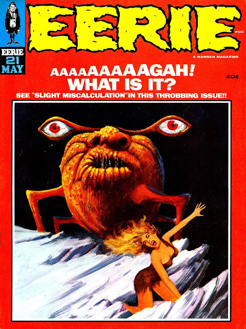
I've spoken a few times of Warren's use of painted covers - let's pull up a pile and take a look. We'll stick to just Creepy and Eerie this time, and we'll still wind up with too many covers to fit in a single post.
First, an odd bit, just because - Odd. Check out the first issue of Eerie:
With that cheaper-to-print black & white image giving it a small press feel, you might think this was perhaps the first Warren publication. But, as noted on the cover, Eerie came after Creepy, and Creepy had painted covers from the first issue. Not to mention that Warren had been publishing magazine for quite some time before Creepy debuted.
So why the stark b&w image? Sure, it's a great piece from
With a name like -3-, it's no surprise that i like things in threes, so next up - another cover post!
But one with a bit of purpose...
covers from the indicated issues of Creepy & Eerie (1964-1982)


My understanding is that Eerie #1 is an ashcan edition
ReplyDeleterushed out to secure copyright of the title.
Oh - Jack Davis, not Joe Orlando, cover.
D.D.Degg
I figured that Eerie #1 never saw the newsstands, but wondered why. Securing copyright seems a likely answer. Not like they had big conventions to put a rush edition together for back in those days.
ReplyDeleteThanks for correcting me on Jack Davis. You are, of course, correct on that. Joe Orlando drew the first story and my brain crossed wires. I've fixed the main post.