
We're running out of year pretty soon, did you notice that?
Any 50 years ago in 1967 sort of things must be tended to in the next several weeks. There was a lot happening in '67 - in fact, it was A Happening in '67. But i'm not in an overly wordy frame of mind, so let's take in something visual - I trust not too abysmal. And let's intersect with another subject i've had on the back burner for quite a while - Warren magazines.
We'll later be talking about what goes on inside the magazines, but today, let's just take a look at Warren's '67 covers. As they developed over the years, their magazines often sported some of the coolest and most interesting visuals on the magazine rack.
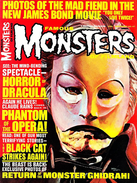
Their Big 3 comic magazines were Creepy, Eerie and Vampirella, with a host of other titles supporting them over the years. But back in 1967, Vampirella was still a stirring in Forry's... imagination. So, instead of Vampirella, here's his other magazine - Famous Monsters Of Filmland. Not a comic magazine, but just around the genre corner:


There's a reminder - Christmas Is Coming! That sounds somehow very different in a post Game Of Thrones world...
Meanwhile, back at Warrens premiere comic magazines... Creepy is the Big Brother of the two titles, being a whole year older. So we'll honor the elderly and let them go first-


Frank Frazetta was a frequently featured cover artist on Warren's publications. Even when re-purposing a pre-existing illustration that many had likely seen before, it was still a good draw on the newsstand. A great number of other fantasy and horror artists' paintings were used on the cover, Warren seeming to splurge on the colour covers to offset the mostly black & white inner contents.
Worked for me, though these were before my time buying the titles. I was still living in Asia at this point, and Warren was having enough troubles with distribution in the USA.
On the cover's of Eerie's mere five issues for '67 we had Frazetta once again leading off-


I particularly like that Gray Morrow cover on #10 above. So simple & clean compared to the typical offerings of the time, and a striking design that makes good use of the white space to draw the eye to the image.
Though perhaps not up to later levels at the peak of their covers, not a bad collection for the year of 1967.
Of course, this is The Voice Of ODD!, so we'd be remiss were we not to peek at the covers of Warren's oddest publication for '67 - Freak Out U.S.A.


Yes, the second issue is actually cover dated for 1968, but it was published in '67 and it was just too damn odd to leave out. I mean - how many of you looked at that and Austin drawled "Yeah, Baby!"?
You can expect to at least see a bit of The Monkees from the first issue (16 pages they got!), as might be expected from some of my previous indications of Monkee mania.
But the question looms in my mind - which covers make you want to look inside the magazine?
Any 50 years ago in 1967 sort of things must be tended to in the next several weeks. There was a lot happening in '67 - in fact, it was A Happening in '67. But i'm not in an overly wordy frame of mind, so let's take in something visual - I trust not too abysmal. And let's intersect with another subject i've had on the back burner for quite a while - Warren magazines.
We'll later be talking about what goes on inside the magazines, but today, let's just take a look at Warren's '67 covers. As they developed over the years, their magazines often sported some of the coolest and most interesting visuals on the magazine rack.
Their Big 3 comic magazines were Creepy, Eerie and Vampirella, with a host of other titles supporting them over the years. But back in 1967, Vampirella was still a stirring in Forry's... imagination. So, instead of Vampirella, here's his other magazine - Famous Monsters Of Filmland. Not a comic magazine, but just around the genre corner:


There's a reminder - Christmas Is Coming! That sounds somehow very different in a post Game Of Thrones world...
Meanwhile, back at Warrens premiere comic magazines... Creepy is the Big Brother of the two titles, being a whole year older. So we'll honor the elderly and let them go first-


Frank Frazetta was a frequently featured cover artist on Warren's publications. Even when re-purposing a pre-existing illustration that many had likely seen before, it was still a good draw on the newsstand. A great number of other fantasy and horror artists' paintings were used on the cover, Warren seeming to splurge on the colour covers to offset the mostly black & white inner contents.
Worked for me, though these were before my time buying the titles. I was still living in Asia at this point, and Warren was having enough troubles with distribution in the USA.
On the cover's of Eerie's mere five issues for '67 we had Frazetta once again leading off-


I particularly like that Gray Morrow cover on #10 above. So simple & clean compared to the typical offerings of the time, and a striking design that makes good use of the white space to draw the eye to the image.
Though perhaps not up to later levels at the peak of their covers, not a bad collection for the year of 1967.
Of course, this is The Voice Of ODD!, so we'd be remiss were we not to peek at the covers of Warren's oddest publication for '67 - Freak Out U.S.A.


Yes, the second issue is actually cover dated for 1968, but it was published in '67 and it was just too damn odd to leave out. I mean - how many of you looked at that and Austin drawled "Yeah, Baby!"?
You can expect to at least see a bit of The Monkees from the first issue (16 pages they got!), as might be expected from some of my previous indications of Monkee mania.
But the question looms in my mind - which covers make you want to look inside the magazine?
all covers from Warren publications (1967)
I don't have even one issue of these magazines. You've made me feel inadequate as a collector. Incidentally, after your introductory sentence, I just can't understand the first sentence of the subsequent paragraph. Translation please.
ReplyDeleteYes, that sentence could have used some grouping like a mathematical equation, hm?
ReplyDeleteAny 50-years-ago-in-1967 sort of things must be tended to in the next several weeks.
Does that help a bit? The point of the sentence being any half-century anniversary/nostalgia features switch to 1968 pretty soon, so better get that 1967 stuff done now.
BTW - I don't necessarily have everything i show on the blog. I have access to several small university collections and archives as well as my own.
Ah, got it now. I'd have said 'Any things from 50 years ago in 1967 must be...etc. At least it gave my brain a workout, which it sorely needs. Incidentally, left a comment on The Third Road.
ReplyDeleteMeant to say, your first 'Monsters' image was, if I remember correctly, one of the storyboard pics for the F meets W movie - or something like that. Do you know if that's the original piece of art used on the cover, or was it a new illustration based on the original?
ReplyDeleteOr maybe it was for a(n) F meets W movie poster - can't quite remember now.
DeleteThat cover illo is early work from Ron Cobb. At that time, he was creating new work for Warren's covers. The figures involved are specifically based on Bela Lugosi and Lon Chaney Jr., which may add to the feel of it being pre-existing production work.
ReplyDeleteJust Googled it, 3 - it's based on the poster art for the movie. (Don't know who the artist is though.)
DeleteWell, that's interesting. My information was pulled from a Ron Cobb biography which specifically referred to the piece while talking about cover work for Warren. So was it just partial information and/or writer unawareness? I'll have to go digging for more info there.
DeleteBut not now. Right now, tomorrow's blog is already in the cue and i'm hunting slavers in Skyrim.
They're gonna learn ya don't do that to the Dragonborn...
It looks like that cover is a re-painting of the art used for the movie posters. The posing is identical, but the layout is a bit different and the colour/texture details are markedly different. So, it looks like the info in the biography was probably correct, but failed to mention the derivative nature of the piece.
DeleteThat's a best guess, of course, and not definitive.
I knew I'd seen it before, but I still have a vague notion that I once saw a rougher version of the poster illo, and it was described as a 'concept drawing' or something like that. I'll keep an eye out for it just in case I'm not imagining it.
Delete